

Modals and user experience
Modals are widely used in user interfaces. Yet, there is a lot of criticism about using them.
The thing is that it's quite easy to solve some design issues by using modals. At the same time you might introduce many problems in UX as well as in DX.
Intro
Small companies often neglect to have a designer. They try to solve most design challenges by using some kind of standard approach.
The decision of using modals usually comes from either developers or CEOs. Because it looks like a simple and quick solution. But there is a trap.
As with any UI control, modals might be suitable or not in each particular case. The problem is that they are often overused.
What's sad is that it's hard to convince and prove that they might be harmful. I like the quote from Michael McWatters
All the research in the world is no match for your CEO’s opinion.
One argument that I hear quite a lot is
Hey, many big companies use them. It'd be silly to think that they don't have a design team that hasn't thought about the pros and cons of this decision. Take a look at X!
What exactly is a modal?
The definition provided by NNGroup:
A modal dialog is a dialog that appears on top of the main content and moves the system into a special mode requiring user interaction. This dialog disables the main content until the user explicitly interacts with the modal dialog.
In contrast, non-modal dialogs and windows do not disable the main content. Showing the dialog box does not change the functionality of the user interface.
To see the difference try to click these two buttons.
In the first case, you won't be able to continue reading this blog.
In the second case, you'll see a small notification in the corner that does not prevent you from reading.
Why it's tempting to use modals
There are a few reasons.
- You can display them anytime and anywhere in your app.
- Since they are centered you don't need to think about how to center the content itself. Imagine a typical layout, where you have a sidebar and some content (e.g. a form with a user profile). How to fill the available space on the screen?
- It is easier to use a one-column layout if you need to use forms. which is a recommended approach
- You can easily return to the content behind the modal by closing it.
In my experience, they are overused a lot because it's super easy to center contentby using them.
Yet, sooner or later you may encounter a lot of problems. Chances are, it'd be better to use a dedicated page, instead of a modal. Let's see what problems we have.
Modal state
Quite often a modal contains a form. In this case, the modal should have some state. And we have to deal with it.
Reset state
The question that I often come up with is: should we reset the state when users close the modal?
For example, imagine there is a form for adding a new customer. The form can have a dozen inputs. Now, when you filled most of them but then accidentally close the modal, would you lose your data?
That's obviously not a good experience.
On the other hand, what if you want to add a new client without saving the previous one? So we need to meet both cases.
- Be sure that users don't lose their data, especially if the form is large
- Be sure that users can clear the form easily.
Now, what if the form was on a separate page, instead of a modal? Users can refresh the page and that's it. It's harder to accidentally refresh the page, then close the modal.
So, the question I always asked myself:
When "openModal" event fires, what should I do with the modal state?
The answer highly depends on the purpose of the form. But usually, managers who I worked with asked me to put an alert if a user tried to close the modal in the "dirty" state.
In any case - most of the solutions were not ideal.
Set state
Another question is setting the state. Imagine you have a list of users and the edit button next to each user.
When you click the button a modal opens with a form that should be pre-filled with the user data. What can go wrong?
Well, in this case you often need to load data from the backend. And it might take some time. So you should display some kind of loader. Here you have many choices:
- Load data before the modal opens. If the API you use is fast enough, while the modal appears (I assume you have some animation) you can load the data.
- You can even try to load the data before starting the transition. But that's never worked fine - the small delay is tangible, so it's definitely not the best choice
- You can show a spinner or a skeleton inside the modal. Make sure that the height of the modal doesn't change. Because it causes a layout shift which makes the impression that your UI is jumping around.
Plus, make sure that you don't show the data that has been loaded from the previous modal.
Content overflow
Another typical usability issue happens when modal content doesn't fit its container. It results in it having a scroll.
One of the worst things that can happen is when users cannot see the scroll because their browser hides it until they hover over the content area.
In some cases, it might seem like the modal misses something but users might not understand that there is something below the container.
Another thing to keep in mind: the primary button should be always visible. This means that it should be placed in the footer, while the body will have overflowing content.
Validation
A very nasty problem happens when you have a long form that doesn't fit the modal, and it has validation. So users fill out the form, scroll down, then click submit, and nothing happens. Because there is an error that they cannot see - it's above.
This case should be taken into account as well. You have many solutions here. Starting from showing a label next to the submit button saying that something was filled incorrectly. And ending with automatically scrolling inside the modal body to the first error.
Page refreshing and URL
A page always has a URL, while opening a modal by default doesn't mean that the URL will be changed. Modal is a
centered <div> with some styling after all.
Yet, sometimes you might need to share a link to the modal. Or you accidentally refreshed the page. So you should think about if it's reasonable to manage modal appearance via URL. Which is usually done by using #hash.
For some modals it might be okay not to care about it. But what if it is a shareable public user profile for example?
When you shouldn't use them
I'm not stating that you should never use them. After all, they are used a lot. What I want to say is if you are making an MVP and you feel like it can bring more problems than profit, then you can consider using a separate page.
In 99% of cases, people use them to center the content. But then, when the app grows, you get more and more problems.
You can solve them, but also you should consider if it'd be better to use a page instead of a modal. Plus, it highly depends on the purpose of the app, since sometimes it's totally okay to use modals from the beginning.
Let's see what are possible red flags.
Red flags
- You have an entity (say, a customer) and you want to make a place where users can edit it. But the amount of
information is huge. For example, you have a few sections. Each section has a large form. There are a lot of
hints and tips, validation, confirmation dialogs, and so on. In this case, it deserves a page, that has a
dedicated URL
/customers/{id} - If your content doesn't fit the screen and the modal has a scroll. Especially if it's a form with validation.
- If in the process of development, you decided to make the modal very big, so that almost covers the whole screen. In this case, it almost resembles a dedicated page. Which has the "return back" link instead of the "x" icon for closing the modal.
Real life example of bad usage
There is a typical situation when you have a list of entities, and you need to edit them.
The task was: when you click the action button, show a modal with the edit form.
Imagine the user filled out some of the fields and then accidentally closed the modal by clicking on the black overlay. Will they lose their data?
On the one hand we might save the data that they have just inputted. But what if the user selects another row? We should display data related to the row selected. Thus, it won't work.
Now your boss makes a suggestion: let's disable closing the modal window if the user clicks on the overlay? Well... might sound a little bit weird, since it's a common behaviour (check out Jakob's law). But okay, it might sound like an option.
Now, you realize that you forgot that the modal can be closed by pushing the Esc button. So you disable this behaviour as well.
But you cannot simply disable any way of closing the modal, right? Otherwise, how would users hide it? You will still have a close button and users will run into the same issue: they will lose the data.
Now your boss makes another suggestion: how about notifying them that "hey, you haven't submitted the form, are you sure you want to close the window?". Well... you realize that you need to implement this as well by checking if the data is dirty.
Alright, but may I ask you a question?
What's the difference between a dedicated page that has a link "return back to customers", and a modal that you cannot close by clicking on the overlay?
When the only way to close it is by clicking the close button/icon which in fact returns you back to the table as well.
Tips
When to use
The most common rule is: if you need to interrupt users and ask for some critical information so that they can continue. Again, this is what stated by NNGroup.
However, this is a bit ambiguous. If you show a modal when users click on the "edit" button in the list of customers, is it critical to show them the modal so that they can...edit a customer? Well, yes.
But in this case we will have all the problems described above.
So my advice would be:
- If you cannot clearly see the benefits of using modals, don't use them
- If the modal contains too many elements, be careful and consider using a dedicated page. Or pay special attention to avoid all the pitfalls it might have.
- It's okay to use them for such things as confirmation dialogs. E.g. if users want to delete their account it would be a good idea to use a modal. Since the action is critical you have to interrupt them. At the same time, the modal itself won't have many things inside it.
- It's okay to use them if the context of using them is secondary. What I mean is the modal would never need to be shared. It doesn't replace the entity page (e.g. user profile or customer page). And it serves supplementary actions. For example, in email service providers it can be the "send test email" modal.
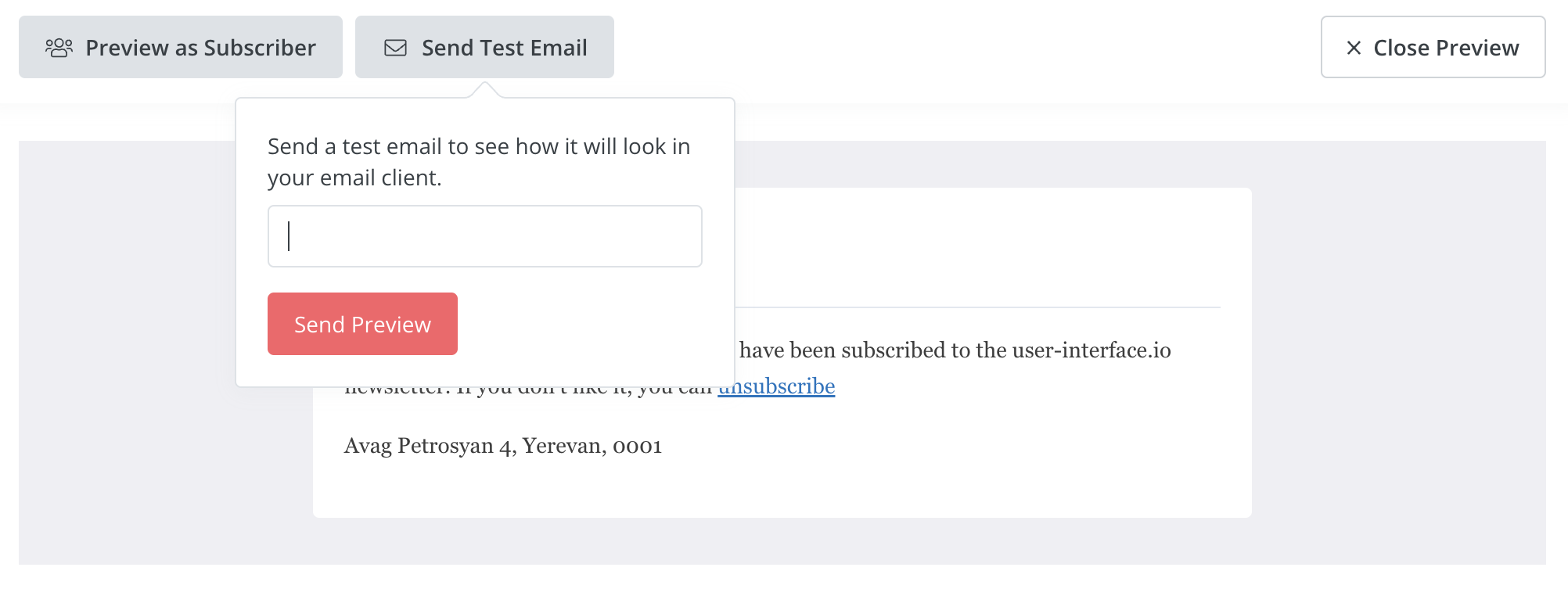
I consider it to be a modal dialog.
If we return to the definition, it says that it should appear on the top of the main content and requires user interaction. The dialog above appears on click, and until I click somewhere else it will stay there. So it requires my attention and interaction. And it covers part of the email template.
By the way, in this case it is a modal dialog inside a modal dialog. Because the whole page is a full screen modal.
Title
Modals should have a title. Since you get users out of their current context, they should know what is going on and what you ask from them. Same for pages. The concept is called Visibility of System Status
Imagine you have a modal for sending a test email notification. If the title says "Send test email", then the submit button should say "Send", but not "Submit". Small details matter.
Autofocus
If you have a form inside a modal, a nice addition to the user experience would be autofocusing the first input right after the modal has appeared. This will reduce the amount of clicks users need to make.
Closing options
Make sure that the modal can be closed by
- Esc button (remember there is accessibility!)
- Clicking on the overlay
- Clicking on the "X" icon at the right top corner
- Clicking on a "cancel" or "close" button inside the modal
Conclusion
While this article barely covers every possible scenario of using modals, I encourage you to think twice before using them. I'm not saying that you cannot do so, many apps do. But this UI element requires more attention than you can think.