

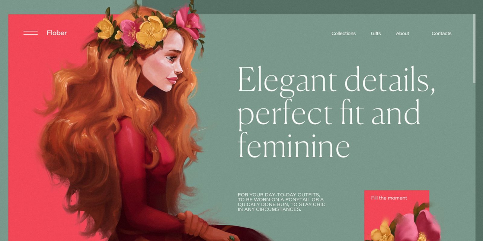
How to control user attention
Customer attention is something that every business wants to get.
Many tricks are used in UI design to do this. Some examples are CTA buttons, accent colors, animations and so on.
There is an endless list of possibilities on how to use your attention, and the list is constantly growing: marketers consistently look for new gimmicks.
In UI/UX design, there are some basic concepts that you should know.
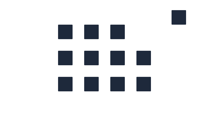
Let's say we have 12 squares. They are completely identical. How can we shift your focus to a specific square?

Distance
If we move any of these squares somewhere far from others, it'll immediately catch our attention.
Size
If every square has the same size, they are all equal. As soon as you change the size of any of them, you'll grab users' attention immediately.

Color
The same applies to colors. As soon as we change the color of any of the squares, our focus will shift to that square.

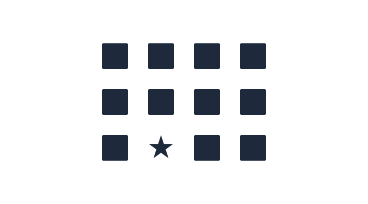
Shape
An item will certainly stand out if it has a different shape.
Motion
Another trick would be to animate an element. This is a widely used pattern; I'm sure you saw CTA buttons with some animations, like shaking or jumping or whatever.
See the Pen Pulsing square animation by Victor (@akcium) on CodePen.
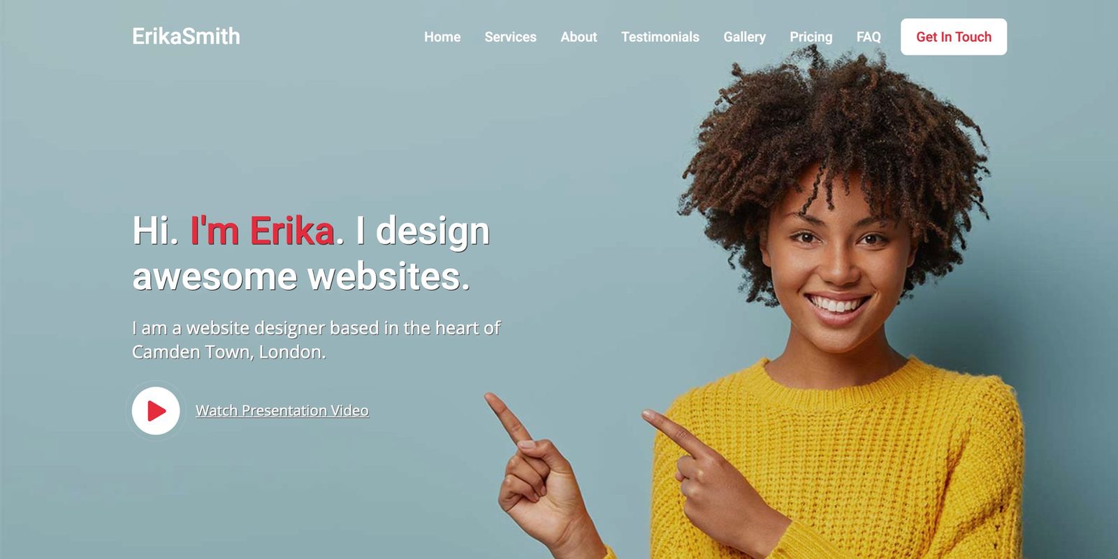
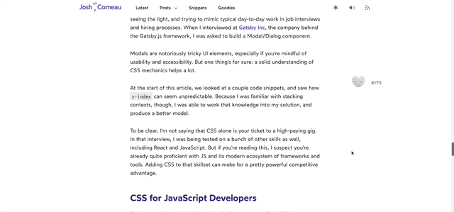
People
A very subtle trick is to place a person looking at or pointing at something. Look at these examples.

Sound
While it's not very common and usually considered a bad practice, the sound definitely attracts our attention.
Now what?
How to apply this in user interfaces? Well, there are plenty of ways.
Say you have several links. If you want to move user focus to a specific link, you can change its color, size, or even animate it.
One of my favorite examples is a trick used by Josh Cameau at his blog. By having this fellow, he got a huge number of subscribers.
Another common trick is to reduce the number of options. There is Hick's law: The time it takes to make a decision increases with the number and complexity of choices.
Look at this chart that perfectly illustrates the idea.

The more choice you give users, the harder it becomes to choose anything. By reducing the number of items, you can make it easier for users to decide by reducing the distraction of having many possibilities.
By combining describing techniques you can lead users to somewhere you need.