

Should required fields be marked?
It might seem like not a big issue, but in the UX world we try to make users life as easy as possible, so even such small detail as marking a field required matters.
I've researched a lot of materials about should we do this or not. The conclusion is...there is no unanimous opinion.
A very popular resource, NNGroup, states: "Using an asterisk to mark required fields is an easy way to improve the usability of your forms. Only marking optional fields makes it difficult for people to fill out the form."
They provide many reasons why we should mark required fields and how to do this. I'm not going to copy the whole article here, you can read it by yourself.
However, there is another famous UI book written in Russian. The author of this book is against marking fields as required due to the following reasons.
Why we shouldn't use asterisks (an opinion)
Let's go over these reasons.
It looks technical, not human. We design for humans, not for machines. Asterisks are "techno-dependent" symbols
In terms of humanity, an asterisk might indeed look technical, a little bit cryptic. But the thing is that people are getting used to the symbol so much that I don't think it's a big issue.
From a philosophical point of view, it might make sense, but in practice, it doesn't have any sense.
Asterisks are an invention of WEB. Operating systems usually don't use them at all.
That's an interesting observation.
But what I realized is that in operating systems most of the forms are related to settings, where you choose options, not sending data to servers.
In most cases, these forms consist of dropdowns, toggles, and checkboxes and have a predefined number of options. So they are all required by default.
In most forms all the fields should be required. If the field is not required, don't ask it.
This one is very true. If it's possible not to ask users something, it's better not to ask. So ideally all the fields are always required. In such a case, it might be obvious that we ask to fill in all of the fields. But that's an ideal world, in reality, things can be more complicated.
If the field is not required, but we still want people to fill it, it's possible to state the requirement inside the field label.
Another interesting approach. The author shows an example where you have a site URL input and the label says "Your site, if you have one". Or, the label is "Site" and there is a hint below it: "if you have one".
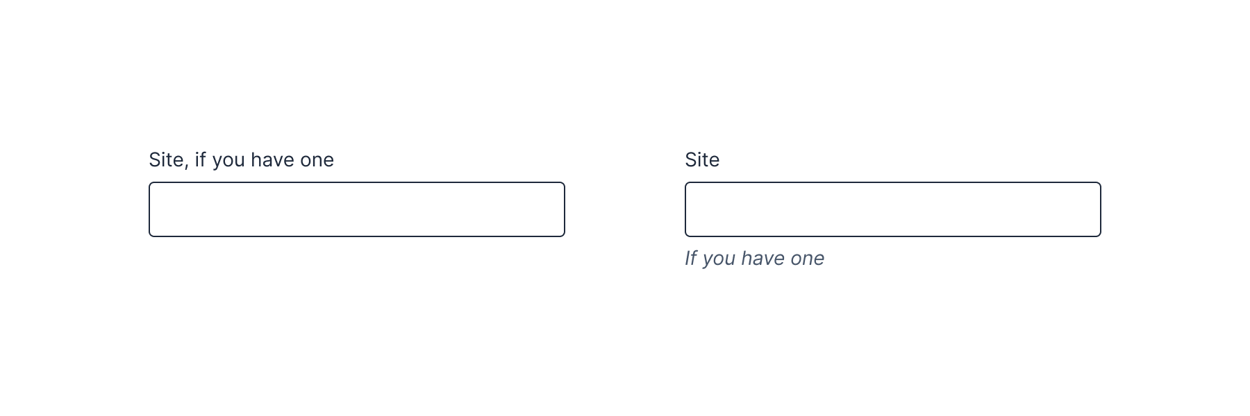
On the one hand, it feels more natural to me. It's like asking people in real life "Hey, may I have caramel syrup if you have one?".
On the other hand, due to our habits, we'll probably more quickly understand if the field is required or not by looking at the asterisk or "optional" label.
That's all related to Jakob's law: "users prefer your site to work the same way as all the other sites they already know".
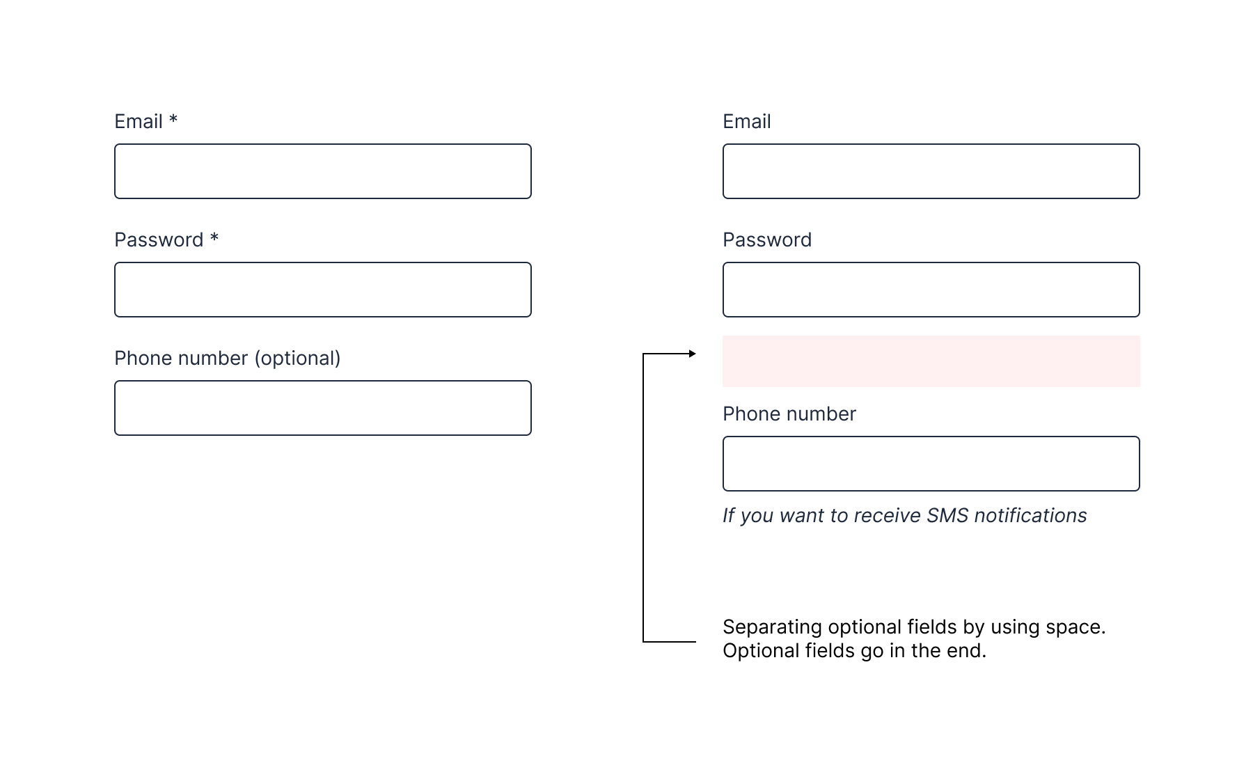
You can separate required and non required fields
This is a nice trick in my opinion. At first ask for required fields, and non-required fields can go later. By using visual separation, the sense of the fields (they should feel optional), appropriate labels and fields, it might be a solution to remove asterisks that clutter other labels.
Disabling the submit button
Another option is to disable submit button before the form is filled.
However, this is quite a dangerous step. There are some situations where it works (such as phone verification form or accepting terms and conditions), but in general it's considered as anti-pattern.
Final thoughts
Don't forget that some of the forms don't need asterisks at all.
Such forms as login, credit cards and probably some other common forms that are already become very common don't need this over-explanation.
The same applied to a form that has one field and it's explicit that you're asking for this form. For example, a phone verification form assumes that you have to fill your verification code and that's it.
Such forms are usually surrounded by appropriate context, such as a title and hints.
Overall, I think it highly depends on the form and each case is unique. I'm still not a fan of marking every field ask required if you have dozens of fields. Remember, apart from Jakob's law, there is a so-called Aesthetic-Usability Effect.