

Vertical vs horizontal navigation
TL;DR: In most cases horizontal navigation is preferable, but if you have a large number of categories (links) that must be displayed right away, you might want to use vertical navigation.
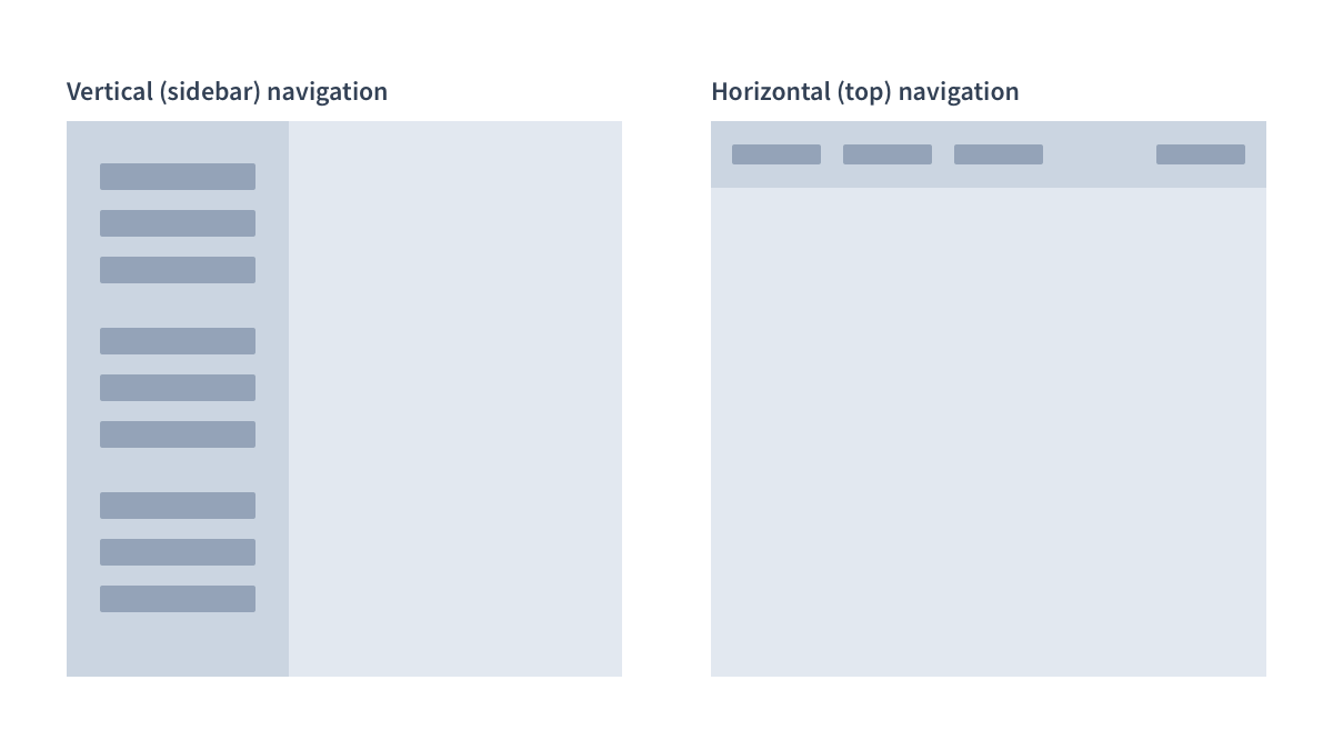
Let's begin with a simple illustration of what I'm talking about. By vertical navigation I mean the one that is typically found on the left side and is called "Sidebar". As for horizontal it's the one that is usually placed at the top.
Each has its own pros and cons, and there is no simple answer about which one to choose. Each case is unique, and you should carefully think about which one to choose. After all, navigation is an essential component of any application.
Below I've compiled pros and cons of each type of navigation that I found and given some thought to each point.
Horizontal Navigation
Pros
- The first and most obvious benefit is that it frees up some space beneath for your content. It could be critical if you have a lot of large images or large data tables on your site. In my experience, having horizontal navigation is really better when you have large tables (e.g. you design an accounting application)
- It is said that most websites use horizontal navigation and thus most people are familiar with it (again, it "feels more natural"). Most websites indeed do use horizontal navigation, and it may be a more familiar pattern for most users. See Jakob's law and Consistency and standards heuristic for the reference.
- People claim that horizontal navigation is more natural because some people read from left to right. I don't think it's important enough to be concerned about. At least, for applications frequently used by the same users. Because users become accustomed to it, and it should not be a problem in my opinion.
Cons
- Limited space. This is the most serious issue. You cannot place many links at once in the horizontal navigation. You can, of course, add sub-menus, dropdowns and so on, but the horizontal navigation will only show the first level of information architecture (the first level of the sitemap tree). That means you should carefully consider the number of links and their names.
- Changing the menu may be difficult due to the reasons stated above. Each time you want to add or remove a link you should think about if it fits the menu.
- Large dropdown submenus cover a part of the main content area.
Vertical Navigation
Pros
- More space available for top level links. That's the biggest advantage of vertical navigation. Vertical navigation is a good choice if you have a lot of links at the top level of your information architecture.
- Unlike horizontal navigation, a vertical one can contain links with long names. They can even be multiline.
- It is easier to add new links (because you often have some space available)
Cons
- Vertical navigation takes up some space and may not be appropriate for applications that display a lot of data in the main content area.
- A lot of space is simply wasted if you only have a few links.
- According to several sources, vertical navigation is less common, which may be confusing for users. I don't think it's a big deal, especially if you have an app that is constantly used by the same people (e.g. SaaS or similar). In this case, users will get used to it.
Which should you pick?
There is no simple answer. Each case is unique.
However, in most cases, horizontal navigation is preferable because it covers more cases than vertical navigation.
There are some special cases that may require deviation from common rules. For example, imagine you make a site focused on visual aesthetics, that should stand out and even broke some usability principles on purpose?
Or you have a very large e-commerce shop, you might even have multiple navigations combined together in some way, as well as breadcrumbs and something else.